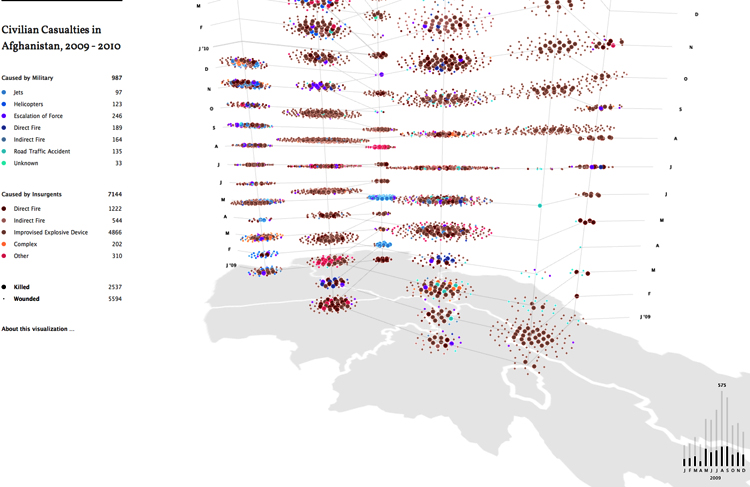
Charting Afghan Casualties

Created by designer George Michael Brower (who by day works at Google’s Creative Lab) and John Bohannon, a molecular biologist and a journalist, the chart shows civilian casualties from the war in Afghanistan. But it does so using a “plume graph” — that is, a map where the 2-D view shows a slice of data, and the vertical axis shows that data evolving over time.
https://www.fastcompany.com/1741900/infographic-day-stunning-3-d-chart-afghan-casualties
